
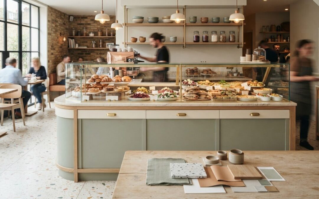
What if the counter colour that best expresses your brand is also the one that makes your food harder to notice? Choosing custom colour finishes for counters means balancing visual identity with the role the counter plays in presenting food and guiding customers through your space. It’s understandable to want a distinctive design, while worrying that a bold finish could compete with the products on display or look different once it’s part of the complete counter.
This guide will help you set a coherent visual direction, translate your brand into a practical design brief and understand what to expect from a bespoke planning process. You’ll explore how colour, finish, food presentation and the surrounding interior work together, so decisions are based on the whole space rather than a sample in isolation.
With more than 25 years’ experience in the food industry, TFSE Products Ltd designs and manufactures temperature-controlled food display counters and heated display units, with bespoke planning, design and installation. We’ll take you from the first visual ideas to the details that help shape a counter for your business and its day-to-day role.
Key Takeaways
- Choose a counter colour that supports both your brand identity and the way customers see the food on display.
- Assess colour in the context of flooring, walls, furniture and lighting to judge how it will work across the complete space.
- Compare restrained, contrasting and brand-led approaches to custom colour finishes for counters, weighing their visual effect, food presentation and interior fit.
- Build a clear design brief around your business identity, counter purpose, visual references and priorities.
- See how a considered brief can guide bespoke planning, design and installation with TFSE Products Ltd.
Why custom colour finishes for counters matter in food retail
A counter has two jobs in a food business. It presents products clearly, and it contributes to the visual identity customers encounter as they enter, browse and order. Its colour and finish are therefore part of the overall design, not an isolated decorative choice. In a café or food retail space, a counter that feels connected to the surrounding interior can help the whole environment appear considered and coherent.
Planning custom colour finishes for counters is different from giving an existing surface a quick refresh or applying a domestic DIY covering. A commercial display counter is designed around its role in the business, including how it presents food and fits into the wider layout. Colour decisions belong in that planning process, alongside the counter’s form and position, rather than being treated as a last-minute surface change.
A counter colour brief is a visual direction that connects your brand identity with the counter’s role in presenting food. This keeps the design grounded in how the space works, as well as how it should look.
How counter colour supports a recognisable brand environment
A counter can reinforce the character a business wants to communicate, whether that identity is understated, welcoming or more distinctive. Begin with the colours already present in your branding, then consider how they relate to walls, flooring, furniture and other visible details. The aim isn’t necessarily to match every surface. Instead, look for a considered relationship that helps the counter belong in the space without appearing disconnected from the business’s identity.
This is especially useful when a counter is a prominent feature in the customer area. A colour choice that works on its own may feel different once it sits beside signage, seating and architectural details. Reviewing those elements together gives the design brief a clearer direction.
Why food display needs to remain central to the design
The food should remain the main point of visual attention. A counter finish can provide a backdrop, but it shouldn’t distract from the products customers are viewing. Consider what appears behind, beneath and around the food, and whether the overall composition feels balanced from the customer’s usual viewing position. The principles of Food Presentation also underline how the visual arrangement contributes to the way food is presented.
Think about the counter as part of the display, not just as a coloured object. For instance, a strong contrast may help define the counter within the interior, while a more restrained direction may allow products and signage to stand out. Neither approach is right for every business. The useful question is whether the finish supports the food display and the identity you want customers to recognise.
Keeping these priorities together gives the project a practical starting point: a counter that feels at home in the interior, expresses the business’s visual identity and keeps attention on what’s being served or sold. That balance is the foundation for a clear design direction, ready to be developed into a bespoke counter brief.
How to plan custom counter colours and finishes around the whole space
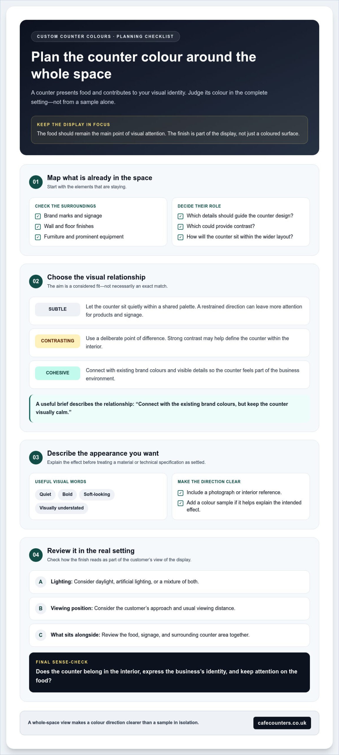
A counter rarely sits in isolation. Its colour is seen alongside flooring, wall finishes, furniture, signage and the products on display, so choosing a direction from a small sample alone can lead to surprises once the full space comes together. Start by reviewing the elements that are staying, then identify which should guide the counter design and which can provide contrast.
Counter colour should be reviewed in the complete environment where the unit will be seen, not judged as a sample on its own. This principle helps turn an initial preference into a visual direction that works in the real setting.
Coordinate the counter with interior finishes and brand colours
Make a short reference list of the colours already present in your business: brand marks, wall and floor finishes, furniture, signage and any prominent equipment. Decide whether the intended look should feel subtle, contrasting or cohesive. For example, a counter might echo one existing detail, sit quietly within a shared palette, or provide a deliberate point of difference. These are design approaches, not fixed colour options; the right choice depends on the space and the identity you want it to express.
Check how colours relate rather than assuming they need to match exactly. A useful brief can describe the relationship in plain language, such as “connect with the existing brand colours but keep the counter visually calm”. That gives the design process a clearer purpose than a colour name alone.
Consider how the finish contributes to the intended appearance
Describe the visual quality you’re aiming for separately from any assumption about how it must be made. Terms such as “quiet”, “bold”, “soft-looking” or “visually understated” explain the effect you want without treating a particular material or technical specification as settled. A photograph, interior reference or colour sample can help make those words more precise.
Review references in the intended setting where possible. A colour can appear different under daylight, artificial lighting or a mixture of both, and a close-up sample won’t show how the counter reads from across the room. Consider the customer’s approach to the display, the usual viewing distance and what will sit beside the counter. If you use digital images, treat them as an initial guide rather than a definitive match.
Keep the appearance decision distinct from the practical requirements of the counter. Consider its intended use, how staff will work around it and how it fits into the food service environment. These details help ensure the visual direction is discussed as part of the complete project, alongside the counter’s function and place in the space.
A clear reference set and a few descriptive phrases give a manufacturer a practical starting point for bespoke planning. If you’re developing a new food display, you can explore a bespoke counter project as part of shaping the wider space.
Compare counter colour directions before committing to a bespoke design
Before settling on a bespoke counter design, compare a few broad visual directions against the same practical considerations. This keeps the decision tied to your business identity, food display and interior, rather than making it a simple preference between colour samples. The comparison below is a starting point for discussion, not a ranking: each approach can work when it supports the purpose of the space.
| Direction | Visual effect | Brand fit | Food presentation | Interior coordination |
|---|---|---|---|---|
| Restrained | Quiet and understated | Can support an identity that favours a subtle, consistent look | May help keep attention on displayed products | Can sit comfortably among existing details without adding another strong feature |
| Contrasting | Distinctive, with a clear focal point | Can suit a business seeking a more noticeable visual statement | Needs careful balance so the counter doesn’t compete with the food | Works best when the contrast relates deliberately to the wider space |
| Brand-led | Expressive and closely connected to the business identity | Draws directly on existing brand colours or visual cues | Consider how the chosen direction frames the products on display | Review it alongside walls, flooring, furniture and signage |
Use the table to identify the trade-offs that matter most. If the interior already has prominent colours or detailed finishes, a quieter counter direction may help maintain visual balance. If the space is simple, a stronger contrast or a more direct reference to brand identity could be worth exploring. Neither is automatically the better choice. The right direction depends on what the business wants the counter to communicate and how it will sit within the whole environment.
When a restrained colour direction may suit the brief
A restrained approach can keep the counter visually composed and leave the displayed food as the primary point of attention. Consider whether the existing interior already provides strong colour, pattern or other visual detail. If it does, adding another prominent element may make the overall setting feel busy. A restrained direction can instead help the counter relate to its surroundings without disappearing from view.
When contrast or brand-led colour may be appropriate
A more distinctive direction can give the counter a clear presence and make it a focal point in the customer area. Brand-led choices can also bring the business identity into the physical space. Before committing, consider how that emphasis will work beside signage, furniture and food presentation. The aim is a coherent design, not a promise that one colour will produce a particular customer response.
To compare options, write down the priority behind each one: product focus, a quieter interior, a visible feature or a closer connection to brand identity. Then review each direction against the same criteria. This gives a bespoke design conversation a useful foundation and helps explain why one visual approach feels more suitable for your food business than another.
Create a clear brief for custom colour finishes on counters
A clear brief helps turn a visual preference into useful direction for a bespoke counter project. It doesn’t need specialist design terminology. Focus on what the counter is for, how it should relate to the business and its surroundings, and which visual qualities matter most. Separate essential requirements from preferences you’re open to refining as the design develops.
Build the brief in this order:
- Business identity: Describe the type of food business and the impression its visual identity should convey. Note any brand colours or existing design elements that need to inform the counter.
- Surrounding space: Record the main details that will remain, including flooring, wall finishes, furniture and signage. Explain whether the counter should blend in, coordinate or create contrast.
- Display purpose: State how the counter will be used and what products it will present. The visual direction should make sense alongside the counter’s role in the customer area.
- Visual references: Gather relevant images, brand materials or interior references that show the appearance you have in mind. Add notes about what you like in each, rather than relying on an image alone.
- Priorities: List what is essential, such as a close relationship to existing branding, and what is a preference, such as a particular level of visual prominence.
What to include in a counter design brief
Be specific about the business type, intended counter use and products to be displayed. Describe the desired colour direction using plain terms such as “subtle”, “cohesive” or “distinctive”, then explain how it should relate to the current interior. Clear visual references help make the goal easier to discuss, while written notes explain what each reference is intended to convey.
For custom colour finishes for counters, separate the look you want from assumptions about the material or technical specification. A reference can communicate a visual preference, but it doesn’t by itself define how a counter should be made. Keep operational needs and essential project requirements clear, then identify the aesthetic details that can be discussed during planning.
How bespoke planning turns a brief into a counter project
TFSE Products Ltd brings over 25 years’ experience in the food industry to bespoke planning, design and installation. Your brief gives the project a clear starting point: it sets out the business context, display purpose and visual priorities so these can inform the wider counter design process. It guides the discussion without assuming a particular finish or outcome before the design has been developed.
For broader project context, the bespoke café counter buyer’s guide can help you consider the counter as part of the overall brief. If you’re ready to develop your ideas into a project, discuss a bespoke counter project with TFSE Products Ltd.
Plan your custom counter finish with TFSE Products Ltd
A considered counter project brings the visual brief together with the practical needs of food display. TFSE Products Ltd is a UK manufacturer of temperature-controlled food display counters, commercial fridges and heated display units for cafés and food retailers. Its bespoke planning, design and installation service provides a structured route from initial ideas to a finished counter project.
For custom colour finishes for counters, the colour direction is one part of a wider design conversation. A useful brief connects your business identity and interior with the counter’s purpose, so the visual decisions sit within the requirements of the food display rather than being treated as a surface choice in isolation.
What working with an experienced counter manufacturer involves
TFSE Products Ltd has over 25 years’ experience in the food industry. That experience informs a process focused on commercial food display and the details of each project. Bespoke planning and design develop the brief into a counter proposal, with installation forming part of the route to the completed project. The brief gives the discussion a clear starting point, while the design process brings together the visual direction and the counter’s intended role.
Share the context that will help shape the project: what type of business you run, what the counter needs to display, where it will sit and how you want it to relate to the wider interior. Images, brand references and a concise description of your priorities can help communicate the intended appearance. Distinguish essential requirements from preferences, so the project discussion can stay focused on what matters most.
This approach differs from applying a quick covering to an existing surface. A bespoke counter is planned as a complete unit for a commercial setting, with its design considered alongside its display purpose. The result of that planning is project-specific; the brief guides the process without assuming a particular colour, finish or design outcome in advance.
Take the next step with a clear project brief
When preparing to discuss a counter project, bring together three essentials: your business context, the products the counter will present and the visual direction you’re considering. Add references that show the appearance you have in mind, and note which details are must-haves versus open preferences. This gives the planning conversation useful context from the outset.
TFSE Products Ltd’s counters are fully warrantied, and parts are available directly from the manufacturer. These details sit alongside the bespoke planning, design and installation service, giving businesses a direct route through the counter project and its ongoing requirements.
If you’re ready to put your ideas into a clear project brief, discuss a bespoke counter project with TFSE Products Ltd.
Turn your counter vision into a considered project
A counter’s colour should feel like a deliberate part of your business, not a decision made in isolation. The most useful next step is to move from collecting ideas to identifying the visual direction you want the finished space to express. Keep the customer’s view of the food display in mind, and let your chosen references guide a conversation about how the counter can support both presentation and identity.
With a clear direction, custom colour finishes for counters become part of a wider bespoke project, shaped around your commercial space and display requirements. You don’t need every detail resolved before beginning. A considered starting point gives the design process something concrete to develop, while leaving room to work through the practical decisions together.
TFSE Products Ltd can guide your counter project from bespoke planning and design through to installation. Take the next step and discuss your bespoke counter project. Your ideas can become the starting point for a counter designed with your business and food display in mind.